Metodika rebranding
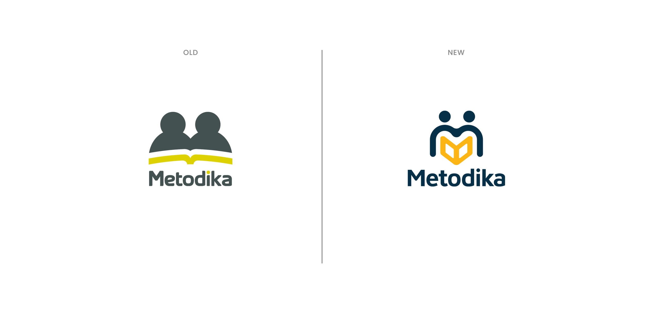
Tutoring centre Metodika was in need of an upgrade. A new logo, new colours, a new look. I recycled the concept of the old logo "two little men with a book" and transformed it into a contemporary icon with bright colours. This logo does not only focus on academic excellence or graduating, it also highlights equality, cooperation and connection between teachers and students. The new colours carry deep meanings: blue symbolises confidence, wisdom and intelligence, while yellow represents knowledge and positive energy. Together they represent the core of Metodika.
